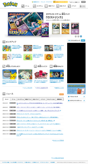
Japanese Pokémon website gets redesign
Makeover adds RSS, visual components
|
The official Pokémon website in Japan updated to feature a new layout. This layout makes the site more geared towards visual audiences, such as children, versus textual audiences. Many pages were redesigned for this figure approach, such as the Pokémon Center page. In addition, the redo added an RSS feed for the site's news.
This redesign comes 4 months after the American Pokémon.com redesign.
